Think about how often you pick up your phone to search for something — a restaurant nearby, how to fix a leaking tap, or the best laptop to buy. You are not alone. More than 60% of all Google searches now happen on mobile devices, and that number keeps growing every year.
If your website does not work properly on a smartphone, you are losing potential customers — and Google is also quietly pushing your website further down in search results. That is the reality of the internet today.
This guide explains what mobile optimization means, why it directly impacts your SEO rankings, and the practical steps you can take to make your website mobile-friendly without needing a complete redesign.
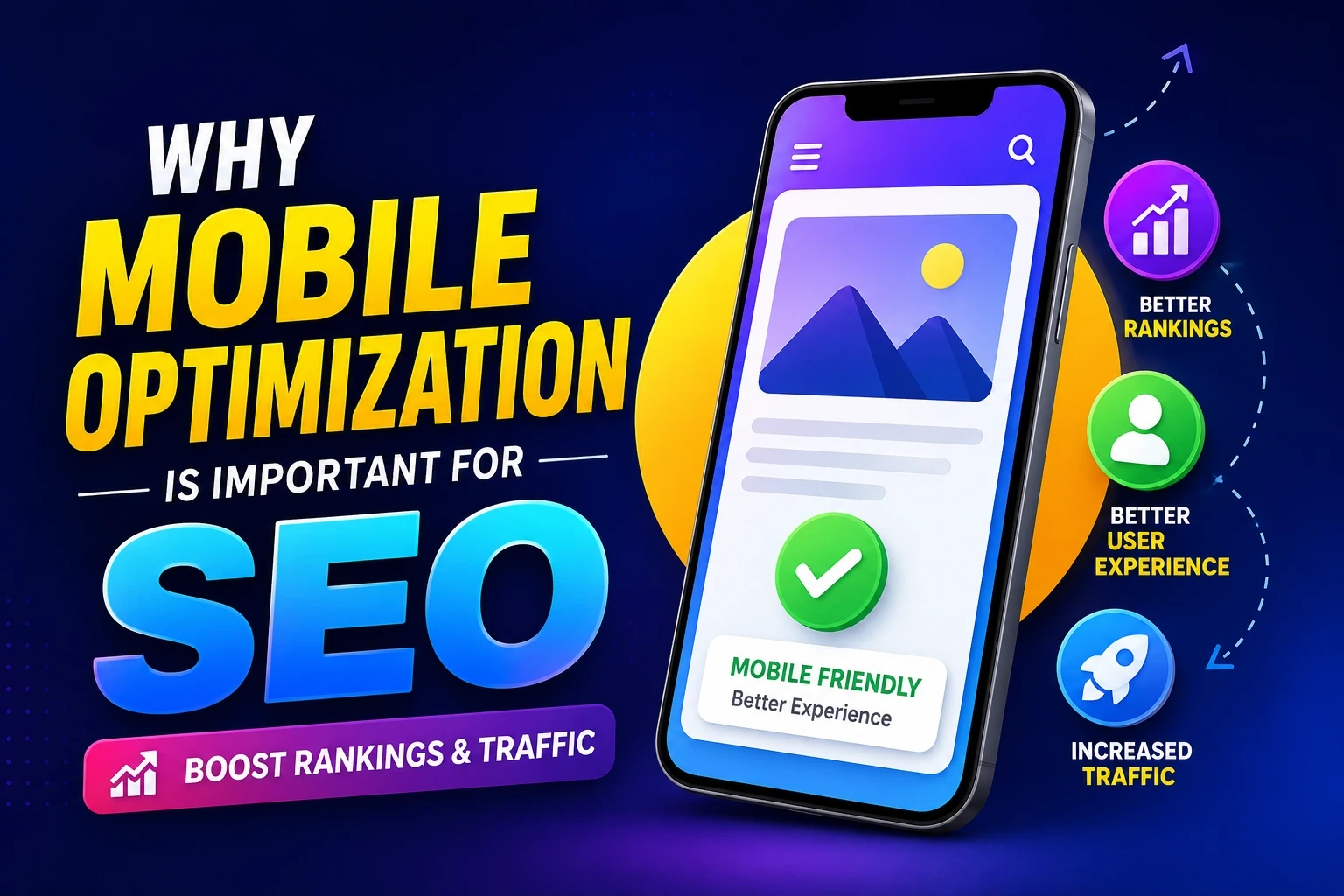
What Is Mobile Optimization?
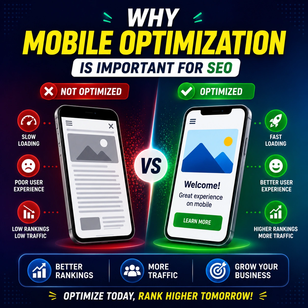
Mobile optimization simply means making sure your website looks good, loads fast, and is easy to use on a smartphone or tablet. A website that is not optimized for mobile often has:
- Text that is too small to read without zooming in
- Buttons that are too close together and difficult to tap
- Images that are too wide and cause horizontal scrolling
- Pages that take a long time to load on a mobile connection
- Forms or menus that break on smaller screens
All of these problems hurt both the user experience and your SEO performance. When visitors land on a difficult-to-use mobile website, they leave quickly — and Google notices that.
Why Google Cares So Much About Mobile
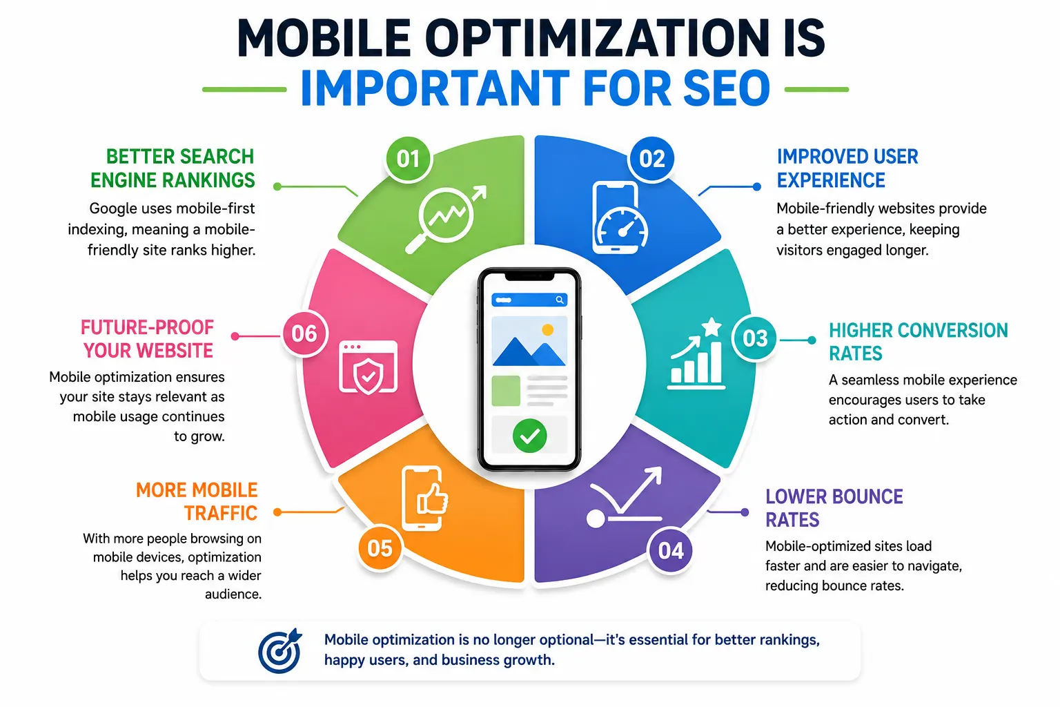
Google made a major change to how it ranks websites. It now uses what is called Mobile-First Indexing, which means Google primarily looks at the mobile version of your website — not the desktop version — when deciding where to rank you in search results.
This shift happened because most Google users are now searching on phones. So Google decided it made sense to rank websites based on how well they perform for mobile users first.
What this means for your business:
- If your desktop website is great but your mobile version is slow or broken, your Google rankings will suffer
- A competitor with a well-optimized mobile site will likely rank above you — even if your content is better
- Google’s ranking algorithm rewards fast, mobile-friendly pages with higher positions in search results
Read Also : Learn How Google Search Rankings Work
How Mobile Optimization Directly Affects SEO Rankings
Mobile optimization and SEO are closely connected. Here is how poor mobile performance can hurt your rankings:
- Page Speed Is a Ranking Factor
Google officially uses page speed as a ranking signal. Mobile users expect pages to load in under three seconds. If your website is slow on mobile, Google will rank it lower. Slow websites also cause visitors to leave before the page even fully loads — a behavior called a high bounce rate — which further signals to Google that your page is not worth showing.
- High Bounce Rate Hurts Your Visibility
When someone visits your website on their phone and immediately clicks back because the page is hard to use, that is a bounce. A high bounce rate tells Google that users are not finding your page helpful or relevant. Over time, this can cause your rankings to drop, even for keywords where you previously ranked well.
- Core Web Vitals Are Now Part of Google’s Algorithm
Google introduced Core Web Vitals as part of its ranking system. These are real user experience measurements that include:
- Largest Contentful Paint (LCP) — how fast the main content loads
- First Input Delay (FID) — how quickly the page responds to a tap or click
- Cumulative Layout Shift (CLS) — whether the page jumps around while loading
Poor scores in these areas — especially on mobile — can reduce your position in Google search results.
- Mobile Optimization Strengthens Local SEO
Local businesses depend heavily on mobile users. When someone searches for a plumber, dentist, or restaurant near them, they are almost always doing it from a smartphone. A mobile-optimized website helps you rank higher in local searches and on Google Maps. If your website is not mobile-friendly, local customers are less likely to contact you — even if they find you in search results.
Simple Signs Your Website Is Not Mobile-Friendly
You might not even realize your website has a mobile problem. Here are common warning signs to watch for:
- Your website looks exactly like the desktop version on a phone (no responsive layout)
- Visitors have to pinch and zoom just to read basic content
- Phone numbers or buttons are not tappable
- Your pages take longer than four seconds to load on mobile data
- Google Search Console is showing mobile usability errors
- You are getting traffic but very few calls or form submissions
If any of these match your situation, your mobile experience is likely costing you both rankings and customers.
Practical Ways to Improve Mobile Optimization
The good news is that most mobile issues can be fixed without rebuilding your entire website. Here are straightforward improvements that make a real difference:
Use a Responsive Website Design
A responsive design means your website automatically adjusts its layout depending on the screen size. Whether someone visits on a large desktop monitor or a small phone, the content reorganizes itself to fit properly. Most modern website builders like WordPress, Squarespace, and Wix offer responsive themes by default — but it is worth testing how yours actually looks on a real phone.
Compress Images to Reduce Load Time
Large image files are one of the biggest causes of slow mobile load times. Compressing your images before uploading them can dramatically improve page speed without any visible drop in quality. Free tools like TinyPNG or Squoosh let you reduce image file sizes quickly. Also consider using next-generation image formats like WebP, which load faster than traditional JPEG or PNG files.
Make Text Readable Without Zooming
A good rule of thumb is to use a minimum font size of 16px for body text on mobile. Text that is too small forces users to zoom in, which creates a frustrating experience and increases the chance they will leave your page immediately.
Make Buttons and Links Easy to Tap
On a touchscreen, buttons and links need to be large enough to tap comfortably with a finger. Google recommends interactive elements be at least 48 pixels tall and wide, with enough spacing between them so users do not accidentally tap the wrong one.
Avoid Pop-Ups That Cover the Screen
Google has a specific penalty for intrusive pop-ups that block the main content on mobile. If a pop-up covers the entire screen when someone visits your page on a phone, it can hurt your rankings. If you use pop-ups for email sign-ups or promotions, make sure they are easy to close and do not obstruct the page content.
Enable Lazy Loading for Images and Videos
Lazy loading means images and videos only load when a user scrolls to them, rather than loading everything at once when the page first opens. This makes the initial page load much faster, especially on slower mobile connections.
How to Test Your Website’s Mobile Performance
Before making changes, it helps to understand where your website currently stands. Here are free tools you can use right now:
- Google’s Mobile-Friendly Test (search.google.com/test/mobile-friendly) — tells you whether Google considers your site mobile-friendly
- Google PageSpeed Insights (pagespeed.web.dev) — shows your Core Web Vitals scores for both mobile and desktop with specific recommendations
Click here : Page Speed Insights - Google Search Console — under the Experience section, you can find mobile usability errors Google has detected on your site
- Simply open your own website on your smartphone and try to use it as a real customer would
Mobile Optimization and Content — Why Both Matter Together
A fast, mobile-friendly website is only part of the equation. The content on your pages also needs to work well for mobile users. Here is what that means in practice:
- Break long paragraphs into shorter ones — walls of text are hard to read on small screens
- Use clear headings so users can scan content quickly without reading everything
- Keep sentences short and direct — mobile readers are often multitasking or on the go
- Place your most important information and calls-to-action near the top of the page
- Make phone numbers clickable so users can call you with a single tap
Good mobile content combined with good mobile performance gives Google every reason to rank your pages higher.
FAQ’s
Does mobile optimization directly affect Google rankings?
Yes. Google uses Mobile-First Indexing, which means it primarily evaluates your mobile website when deciding where to rank your pages. A poorly optimized mobile site will typically rank lower than a competitor with a well-optimized one, even if the content is similar.
My website already looks fine on my phone. Is that enough?
Not necessarily. Looking fine visually is different from being fully optimized. Your site may still have slow load times, unclickable buttons, or Core Web Vitals issues that hurt your SEO even if it appears visually acceptable. Use Google PageSpeed Insights to get a full picture.
How long does it take to see SEO improvements after fixing mobile issues?
After making mobile improvements, Google typically needs a few weeks to recrawl and re-evaluate your pages. Many businesses notice measurable changes in organic traffic and rankings within four to eight weeks of making meaningful mobile optimizations.
Is mobile optimization the same as having a mobile app?
No. Mobile optimization refers to making your existing website work well on smartphones and tablets. A mobile app is a separate product that users download. For most small and medium businesses, optimizing the existing website is far more impactful and cost-effective than building an app.
Can a slow mobile site hurt my local SEO too?
Absolutely. Local searches are dominated by mobile users. If someone searches for a business near them and your page loads slowly or is difficult to use on their phone, they will leave and choose a competitor. This impacts both your website rankings and the perception of your business online.
Final Thoughts
Mobile optimization is no longer an optional upgrade — it is a fundamental requirement for any business that wants to be found on Google. With most searches now happening on phones, and with Google using the mobile version of your website as its primary ranking reference, a poor mobile experience directly translates into lower rankings and fewer customers.
The encouraging part is that mobile optimization does not have to be overwhelming. Start by testing your current website on a real smartphone. Check your PageSpeed Insights score. Fix image sizes, improve button spacing, and make sure your content is easy to read without zooming. Small, consistent improvements add up to meaningful gains in both user experience and search visibility.
Businesses that invest in a fast, easy-to-use mobile website consistently rank higher, attract more visitors, and convert more of those visitors into real customers.